Prior to testing pauses during the Covid-19 pandemic, I used Georgia Milestones data to analyze performance and answer five questions that interest me about Atlanta Public Schools (see 2018 and 2019 analyses). I find it helpful to use consistent metrics over time, so below I have tried to answer the same questions this year, using the same approaches.
Because testing data from 2020 and 2021 were impacted by the pandemic, the averages are unreliable. Therefore, I use data from 2011 through 2019 and 2022 through 2023 in my analysis.
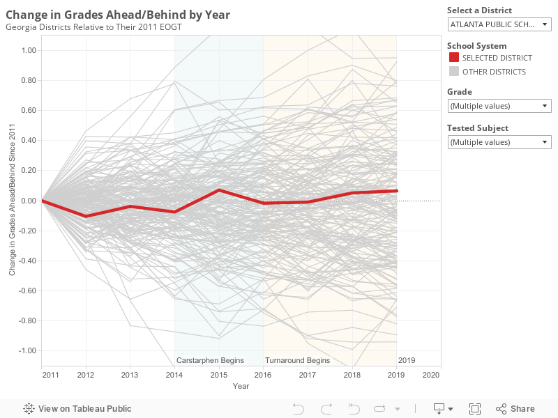
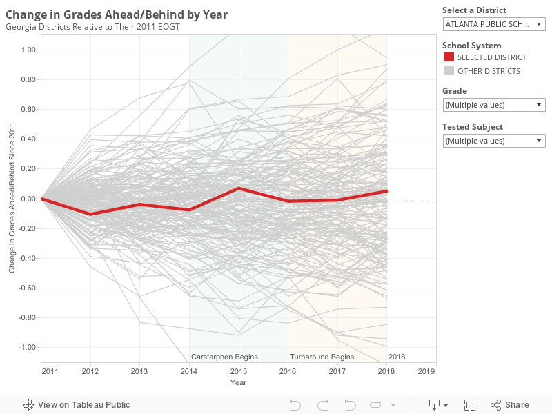
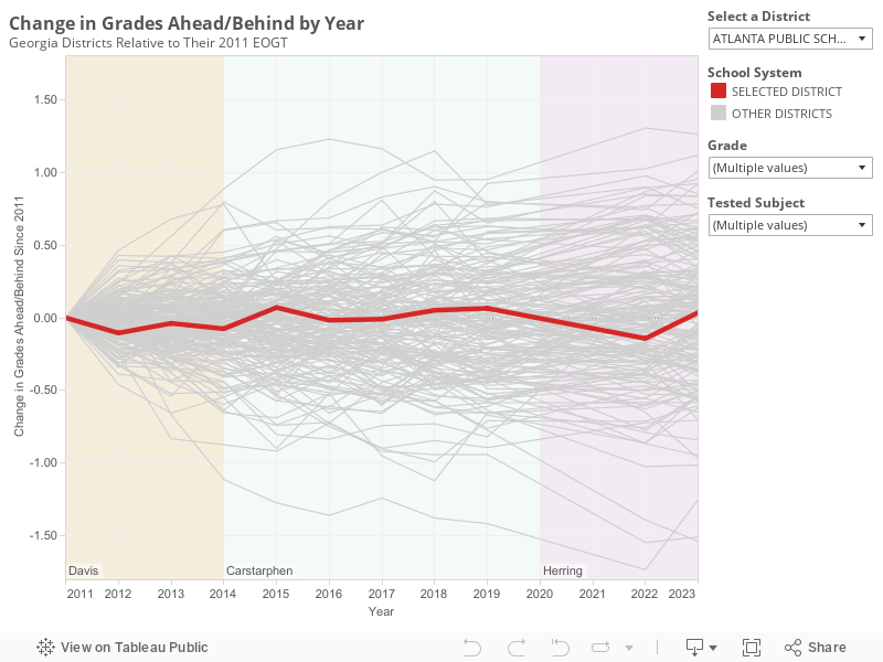
1. Has achievement in Atlanta Public Schools (APS) changed?
Not really.
Through twelve years and three superintendents, APS has performed similarly relative to the state. Back in 2011, the average student in the district scored 0.62 grade levels behind the state. In 2023, the average student scored 0.57 grade levels behind the state. The highest score occurred in 2015 and the lowest in 2022.
Compared to a year ago when scores were slightly lower than the historical average, scores went up by 0.18 grade levels this year.
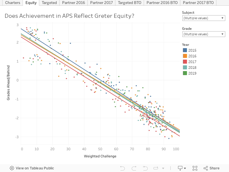
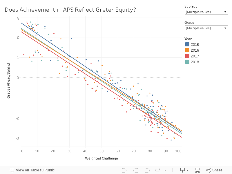
2. Is achievement in APS more equitable than it used to be?
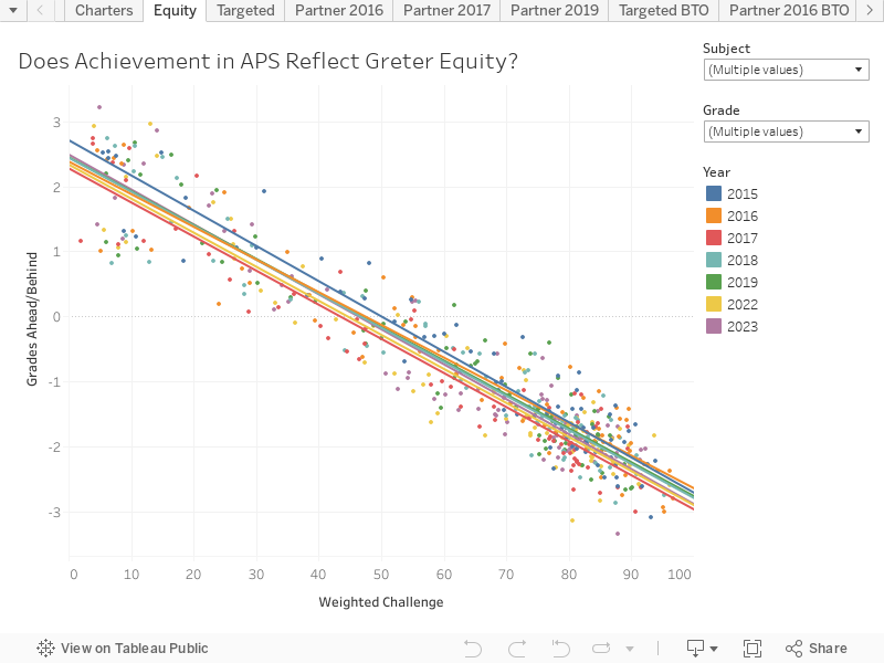


No.
Outcomes in APS are not more equitable today than they were a few years ago. Across the country, huge gaps exist between poor students and their wealthier peers. For the nation as a whole, students at the wealthiest schools score about 6 grade levels above students at the poorest schools.
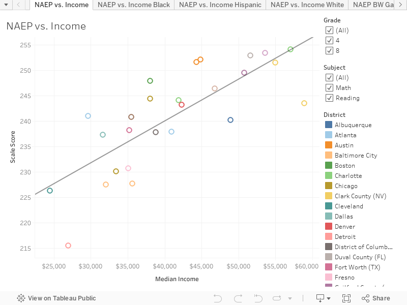
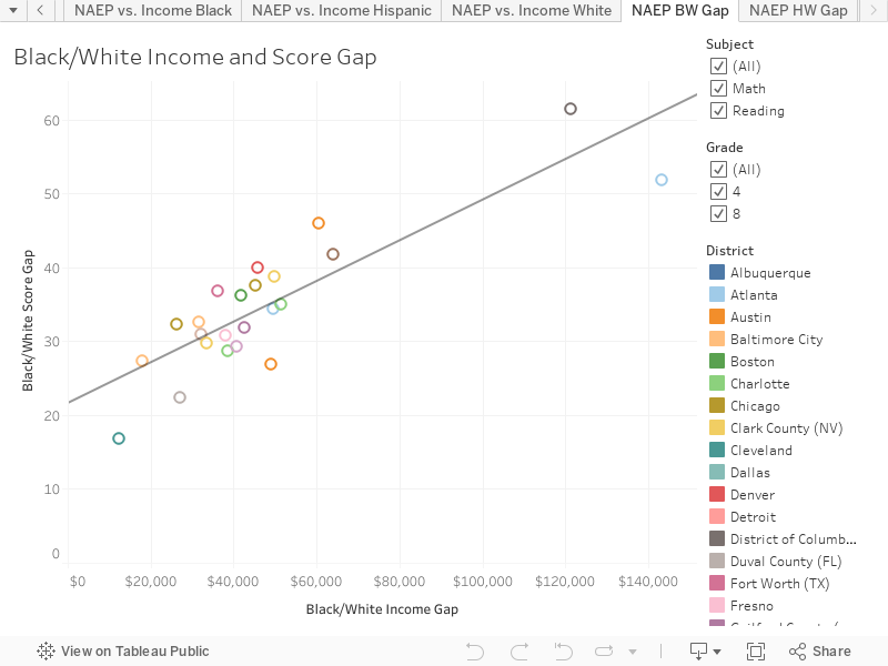
Consider the graph below. A perfectly equitable district would expect to see student outcomes be independent of how wealthy or poor a school is. That would mean a flat trend line. In APS, the slope is similar to the country as a whole.
Students at the poorest schools would need to go to school 6 years longer to catch up with students at the wealthiest schools. Because achievement plays a very limited role in how long students are educated, most of the students who are behind will never receive the additional schooling needed. Instead, they will receive diplomas and enter the world with weaker math and reading skills. At that point, they will either have to pay to receive remediation in college or forego higher education. Sadly, many will take out student loans to pay for remediation but ultimately fail out of college.
The equity slope has not changed over the past few years. The district has implemented a funding system that provides more resources to schools with lower-income students; however, that initiative has not improved student achievement at the schools receiving the additional resources. The downward slope of achievement is the same as it has been for the past eight years.
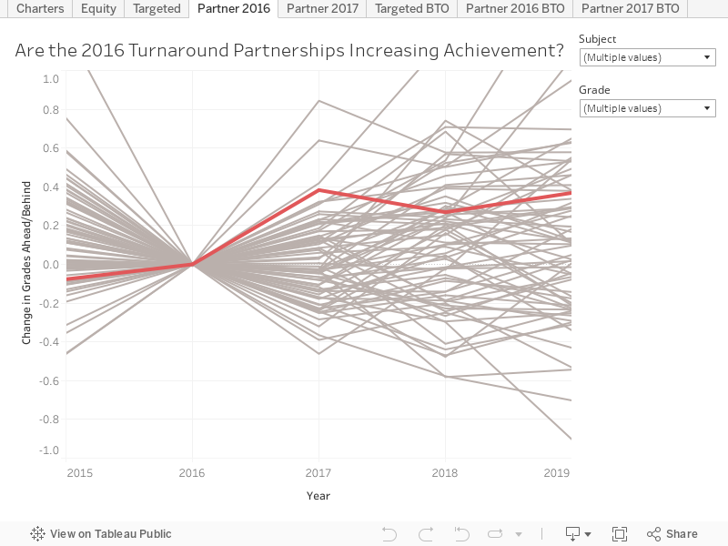
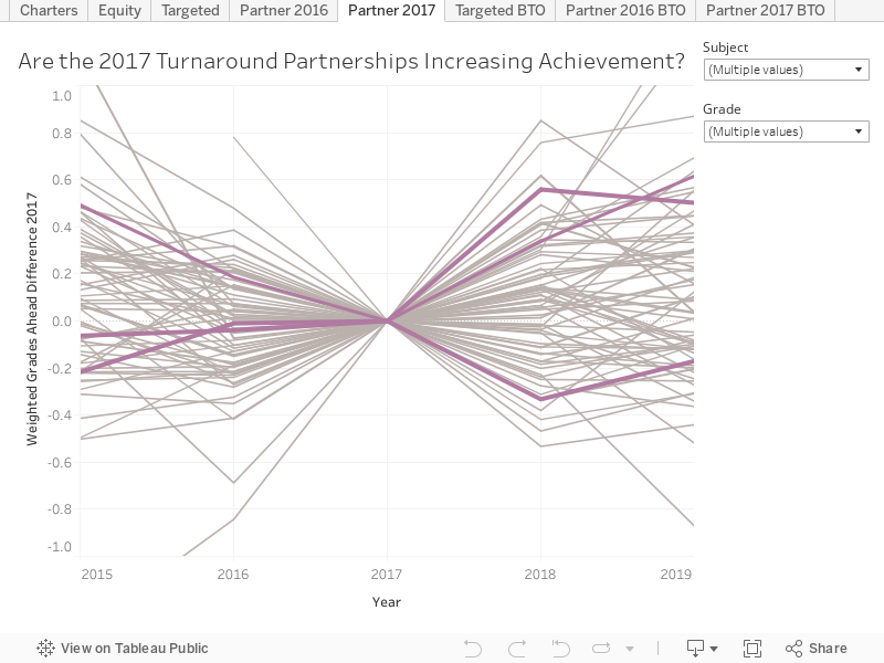
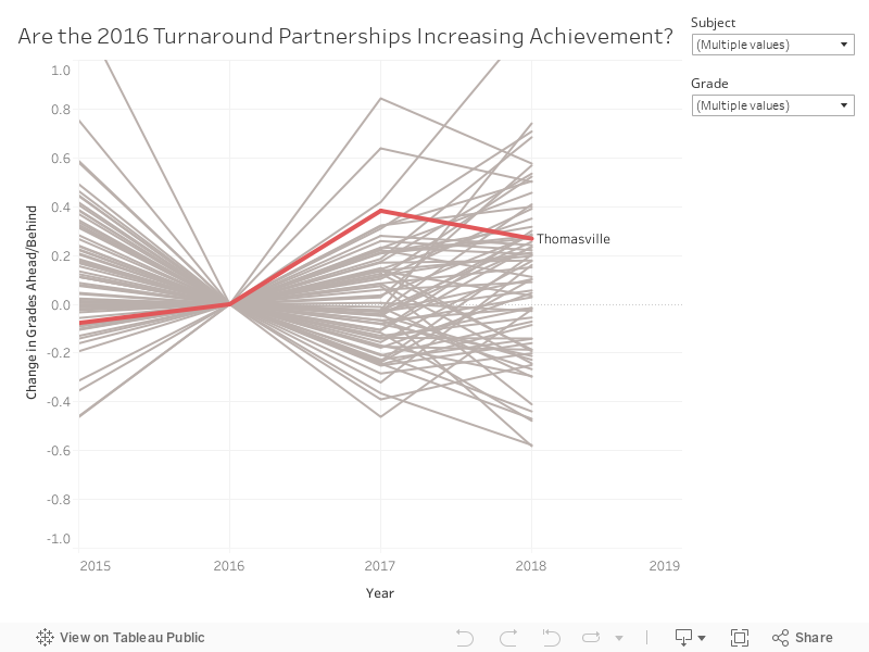
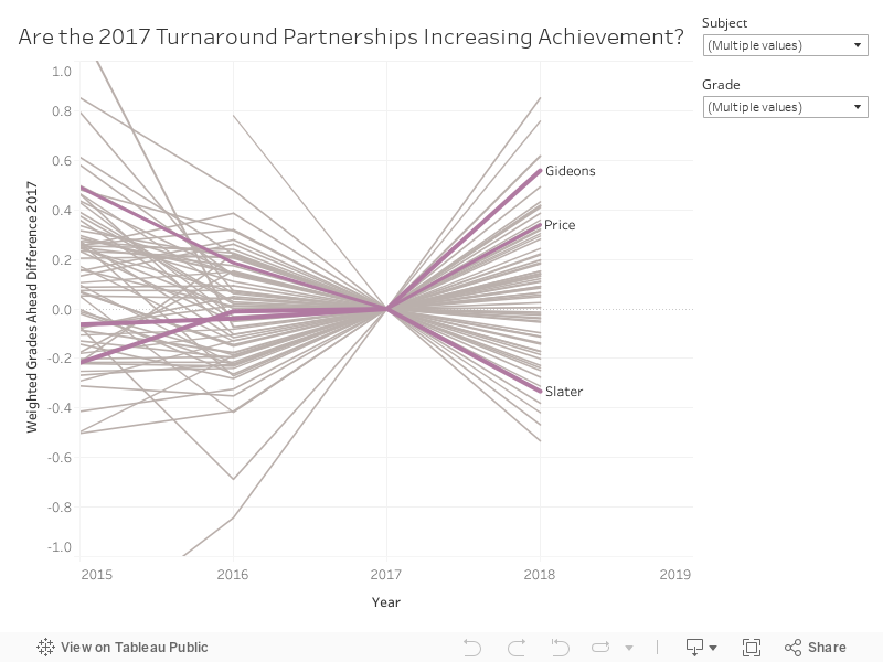
3. Are the turnaround partnerships increasing achievement?
It is not clear that the turnaround partnerships are having an impact on student achievement. It is possible they are having a very modest positive effect.
APS launched a turnaround plan a few years ago. One component of the plan transfers management of several district schools to charter operators (Purpose Built, Kindezi, and KIPP). The partnerships were phased in from 2016 through 2019.
One way to analyze the impact of these partnerships is to look at how the schools were doing before the partnership and compare that to how they are doing after the partnership. The three graphs below do that for partners based on the timing of the intervention.
2016 Partnership (Thomasville Heights - closed after 2022 Milestones)
2017 Partnerships (Slater, Gideons, and Price)
2019 Partnership (Woodson Park Academy)
Three of the four schools operating in 2023 scored higher than they did prior to the partnership. On average, the schools scored 0.1 grades higher, so the increase is extremely modest and may just be noise. The light grey lines in each graph are other schools in the district and these lines illustrate how school scores fluctuate over time for any number of reasons. Unless an intervention leads to a change greater than normal fluctuation, we can't be certain it had an impact at all.
I did the same analysis above, controlling for changes in the challenge index. Over a period of seven years, a neighborhood and its students can change. The result may be that a school's average student in 2023 faces more or less challenges than the average student did in 2016. After controlling for challenge index, the schools still scored 0.1 grades higher, again a very small change and not clearly anything other than noise. Click these links to see those analyses for 2016, 2017, and 2019 partners.
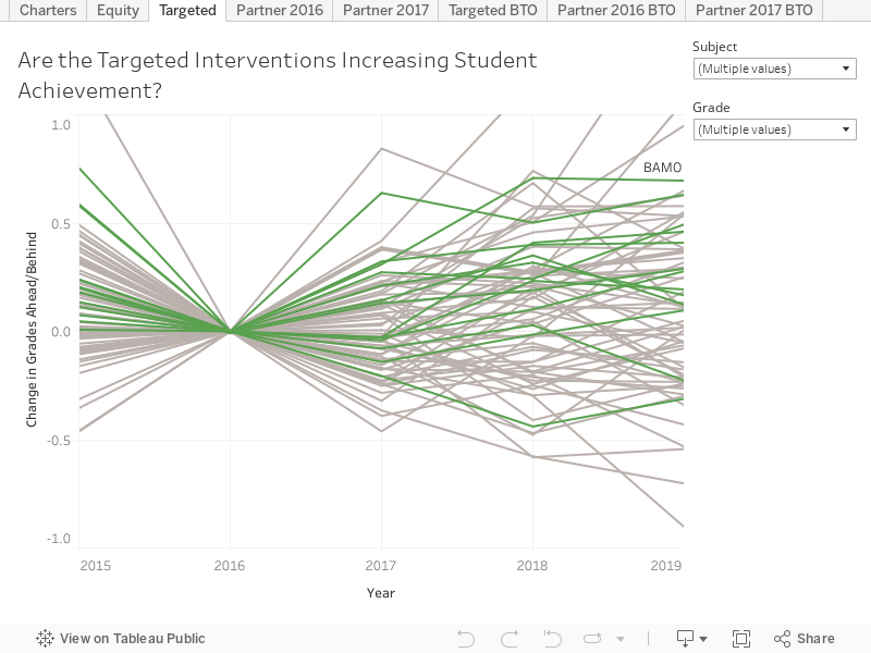
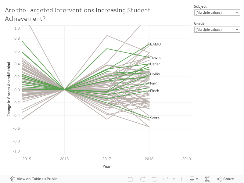
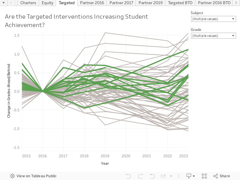
4. Are targeted interventions increasing achievement?
At the same time APS launched its partner school program, it identified certain schools to receive district-led interventions. Performance at at targeted schools in 2023 was 0.3 grade levels higher than 2016 performance. This is slightly higher than the increases seen at partner schools.
If one controls for changes in the challenge index, the 2023, results are up 0.2 grade levels since the 2016 intervention.
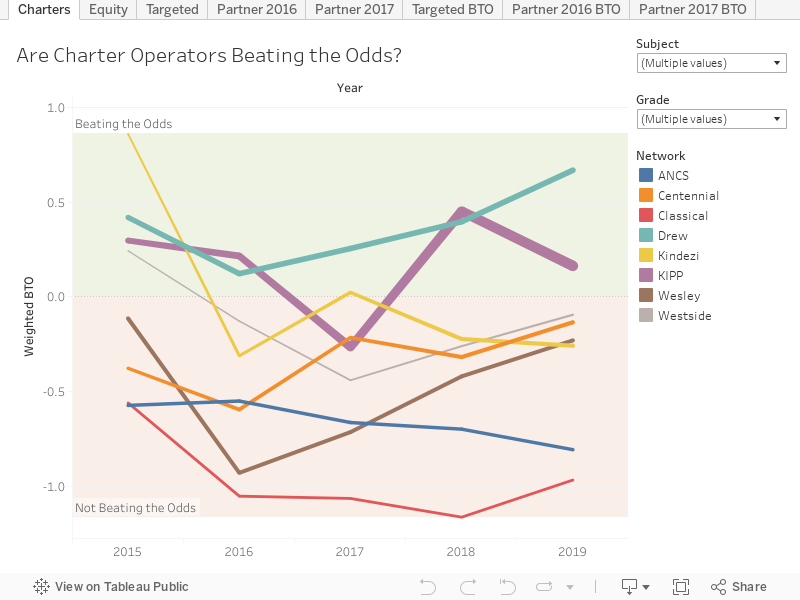
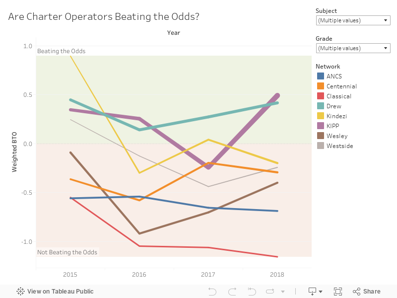
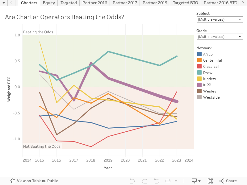
5. Are charter operators beating the odds?
Drew is, but 85% of charter students attend a school or a network that is not beating the odds. On average charter students are 0.3 grade levels behind.
About twenty-five percent of APS K-8 students now attend a locally-approved charter school. In 2023, students at Drew scored 0.6 grade levels above what would be expected of them based on the needs of the students who attend.
All other charter operators performed worse than would be expected based on the students who attend.
Broadly, charter achievement has declined in recent years. Networks that were previously exceeding expectations no longer are. Kindezi students went from scoring 0.9 grade levels ahead in 2015 to 0.6 grade levels behind in 2023. KIPP students went from scoring 0.3 grade levels ahead of what would be expected in 2015 to 0.3 grade levels behind in 2023.
Atlanta Classical is one exception to the trend of declining charter achievement. The school has shown steady improvement over the past 5 years. Students at the school went from scoring 1.2 grade levels behind what the challenge index would predict to only 0.1 grade levels behind. In math, which is believed to be more malleable to school-based instruction, the school now meets expectations.
The graph below shows a history of performance by charter operator.