It’s Georgia Milestones scores time again! I always look forward to the state releasing
scores on the annual exams. It gives a
good reason to check in on whether different initiatives are having their
intended effect. As I explained
a few years ago, the score releases have so many numbers and are hard enough to
interpret that they tend to provide lots of fodder for misguided newspaper
headlines, tweets, and emoji high-fives.
In general, the conversation overstates how much fundamentals in a
district or school change from one year to the next.
Below I’ve tried to take a relatively rigorous look at five
questions that interest me about Atlanta Public Schools.
It’s worth caveating that all the comments below are based
on test scores. If you believe test
scores are effective measures of what we want schools to teach students, you
may find these conclusions useful. If
not, nothing below will likely be of interest to you because this is about the Georgia
Milestones.
1. Has achievement in Atlanta Public Schools (APS) changed?
Not really.
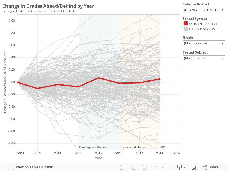
For each of the past seven years, APS has performed
similarly relative to the state. Back in
2011, the average student in the district scored 0.62 grade levels behind the
state. In 2018, the average student
scored 0.55 grade levels behind the state.
The highest score occurred in 2015 and the lowest in 2012.
In general, district scores jump around a bit from one year
to the next. The graph below shows how
changes in APS scores compare to changes for all the other districts in the
state. From this graph it becomes clear that what's remarkable about APS is how little scores have moved.
One reason APS scores haven’t moved much is that it’s a large
district. Small districts tend to see
more variation in their scores from one year to the next. However the stability in APS scores is noticeable even relative to similarly sized districts. Among large metro districts, Fulton,
Gwinnett, Cobb, Clayton and Forsyth all saw score changes that were more
substantial than those in APS (both up and down).
A second reason that APS scores haven’t changed much is that
the needs of students served by the district remain relatively stable. The district is slowly gentrifying. Over the past 4 years, APS has produced a
consistent measure of needs for test takers in the district.[i] That measure is called the challenge index
and you can read more about it here. It fell slightly from 60 to 58 over the past
four years.
Overall, performance in APS is about the same. It has perhaps ticked up very slightly, and its
students have become slightly less needy, but overall the changes are incredibly modest.
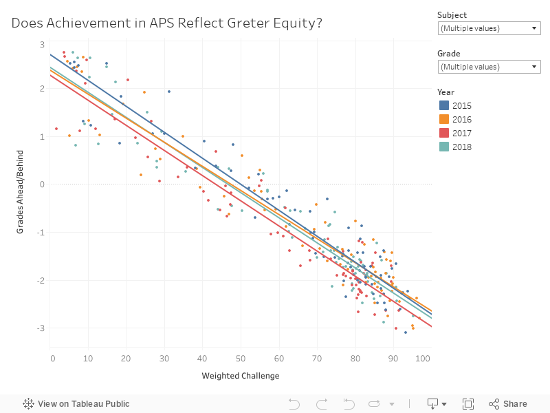
2. Is achievement in APS more equitable than it
used to be?
No.
Outcomes in APS are not more equitable today than they were a few
years ago. Across the country, huge
gaps exist between poor students and their wealthier peers. For the nation as a whole, students at the wealthiest schools score
about 6 grade levels above students at the poorest schools.
Consider the graph below.
A perfectly equitable district would expect to see student outcomes be
independent of how wealthy or poor a school is.
In APS, the slope is similar to the country as a whole. The slope has not changed over the past few
years.
Equity in the district is about the same as it has been.
3. Are the turnaround partnerships increasing
achievement?
Possibly.
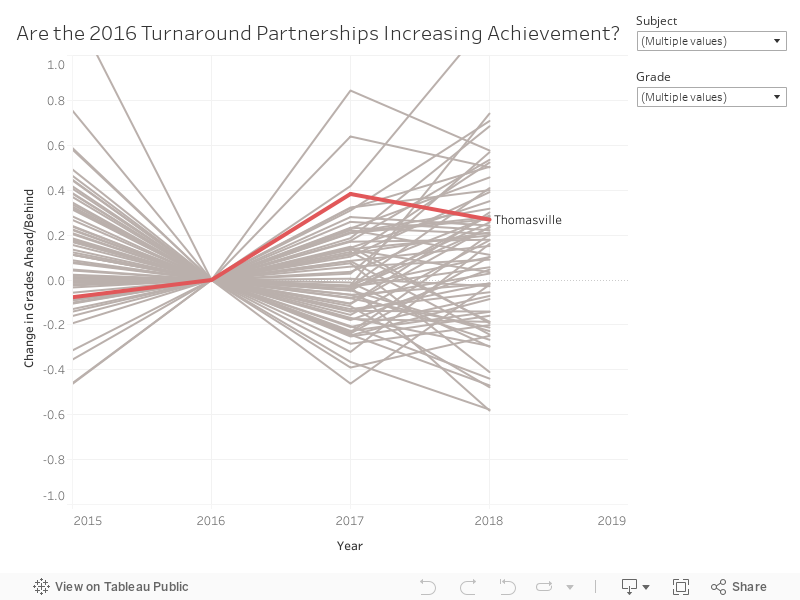
APS launched a turnaround plan a
few years ago. One component of the plan
transfers management of 6 district schools to charter operators (Purpose Built,
Kindezi, and KIPP). The partnerships are
being phased in over several years. Results
are available now to allow us to look at the 2016 and 2017 partnerships to see
how they’ve done.
One way to analyze the impact of these partnerships is to
look at how the schools were doing before the partnership and compare that to
how they are doing after the partnership.
The graph below does that for Thomasville Heights, the only partnership
rolled out in the fall of 2016.
The results show that scores at Thomasville were 0.4 and 0.3
grade levels higher in 2017 and 2018, respectively, than they were in 2016, the
last year before the partnership. This
is encouraging, but scores at schools change for all kinds of reasons, so its
helpful to think about how these changes compare to other schools in the district
(shown in grey). We can’t say for sure
that changes from one year to the next aren’t just noise unless we see that the
changes are outside of the normal range that schools experience.
The change from 2016 to 2017 is greater than the change that
occurred for 96% of other APS schools. The
change from 2016 to 2018 is greater than the change that occurred for 70% of
other APS schools. So, I would say that
the best evidence is that the turnaround at Thomasville has had a positive impact,
but the improvements are not so dramatic that they are unheard of. For example, Burgess (a traditional public
school) saw scores rise faster.
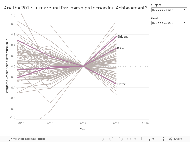
In the fall of 2017, three additional partnerships began at
Gideons, Slater, and Price. A similar
analysis is shown for these schools below.
Two saw scores improve, while one saw scores decline. The greatest increase was at Gideons. Scores increased by 0.6 grade levels from
2017. This improvement was greater than
96% of APS schools. Hope-Hill was the
only traditional public school that saw a similarly large increase in scores.
One might wonder if the improvement in scores at partnership
schools is driven by changing student populations. Maybe wealthier families who would not have
considered the school before are willing to give it a shot under new
management. I did the same analysis
above, controlling for changes in the challenge index, and the results were
consistent. Click these links to see
those analyses for 2016
and 2017
partners.
4. Are targeted interventions increasing
achievement?
Not much.
A second component of the APS turnaround strategy was to
provide additional resources to several schools that had performed poorly in
the past. The plan included small-group
tutoring and mentoring of principals.
Overall, there is not much evidence that these investments are paying off. In 2017 about half the schools
saw scores rise while the other half saw scores fall. In 2018, results look a little better, but that
picture doesn’t
hold up once you control for changes in the challenge index.
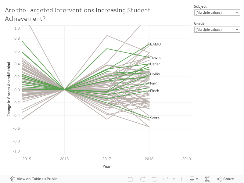
It seems like year-to-year changes at these schools may be driven by noise and school-specific things (for example leadership or staffing changes) rather than the targeted intervention strategy. The biggest increase among the targeted schools occurred at
BAMO. The biggest decline occurred at
Scott.
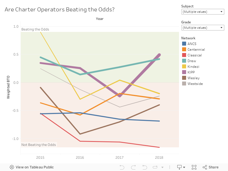
5. Are charter operators beating the odds?
KIPP and Drew are. Others are not.
About twenty percent of APS K-8 students now attend a
locally-approved charter school. In
2018, students at KIPP scored a half a grade level above what would be expected
of them based on the needs of the students who attend. Drew students also performed better than
would be expected by 0.4 grade levels.
All other charter operators performed worse than would be expected
based on the students who attend. The
worst performance occurred at Atlanta Classical. Students at that school scored 1.2 grade
levels behind what would be expected. In
math skills, which are often thought to change more with school inputs,
the performance was 1.8 grade levels behind.
Even though Atlanta Classical has one of the wealthiest student
populations in the state, about half the schools in the state score better at
math. Students at the traditional public
school, Jackson Elementary, have a similar challenge index. However, in math, students at Jackson score
2.5 grade levels ahead of Atlanta Classical.
The graph below shows a history of performance by charter
operator. For some, performance has
varied from year to year. For others, it
has been consistently above or below expectations.
For more analysis and to investigate specific schools, visit APS Insights.
For more analysis and to investigate specific schools, visit APS Insights.
[i]
Before this, a different measure (Free and Reduced Lunch) was generally
used. Over time, this measure became less
and less accurate due to changes in federal policy, so districts and
researchers moved toward measuring student needs in more accurate ways.
Thank you for sharing this information,very helpful and insightful. Much appreciated.
ReplyDeleteAwesome analysis! Thank you.
ReplyDeleteIs it logistically impossible to measure by student or by class? I have never understood why current 3rd graders are compared to last year's 3rd graders instead of being compared to last year's 2nd graders. Wouldn't it make more sense to compare scores for the same group of students over time? I realize retained students would skew the results. With all the individual tracking computers can now do, why isn't this being done for students to measure school effectiveness?
ReplyDeleteGood points - yeah ideally student level data would be used and that opens up some better methods. This is just using school-grade-subject data. The benefit is it’s all publicly available, but there is a downside in terms of rigor/methods available.
DeleteThis is great analysis! Thanks for sharing! Just a clarifying question: When you use the phrase "Beating the Odds" in #5, you aren't referring to the state's metric (also called "Beating the Odds") that compares a predicted CCRPI score for a school to the actual CCRPI score the school earns, correct? I'd love to know more about how you are using the school-grade-subject data to quantify grade levels (I'm guessing mean scale score maybe?)
ReplyDeleteCorrect. I'm using the mean scale score (normalized into grade levels so that it is easier to interpret) and then comparing that to the expectation from the challenge index (which is calculated for the students in each test-grade-subject combination).
DeleteVery helpful and insightful. Wondering how you come to the definitive conclusion that KIPP is beating the odds. Just based on the graph above? Given the year to year variation within school, 3 of 4 years above 0 looks like a fairly probable outcome even if they were no better than average.
ReplyDeleteWhen I said which charters beat the odds, I meant for 2018. You are right that some of the history has not always matched 2018.
Delete